MUST READ ART BLOGS
.webp)

.webp)
.webp)
.webp)
.webp)
.webp)
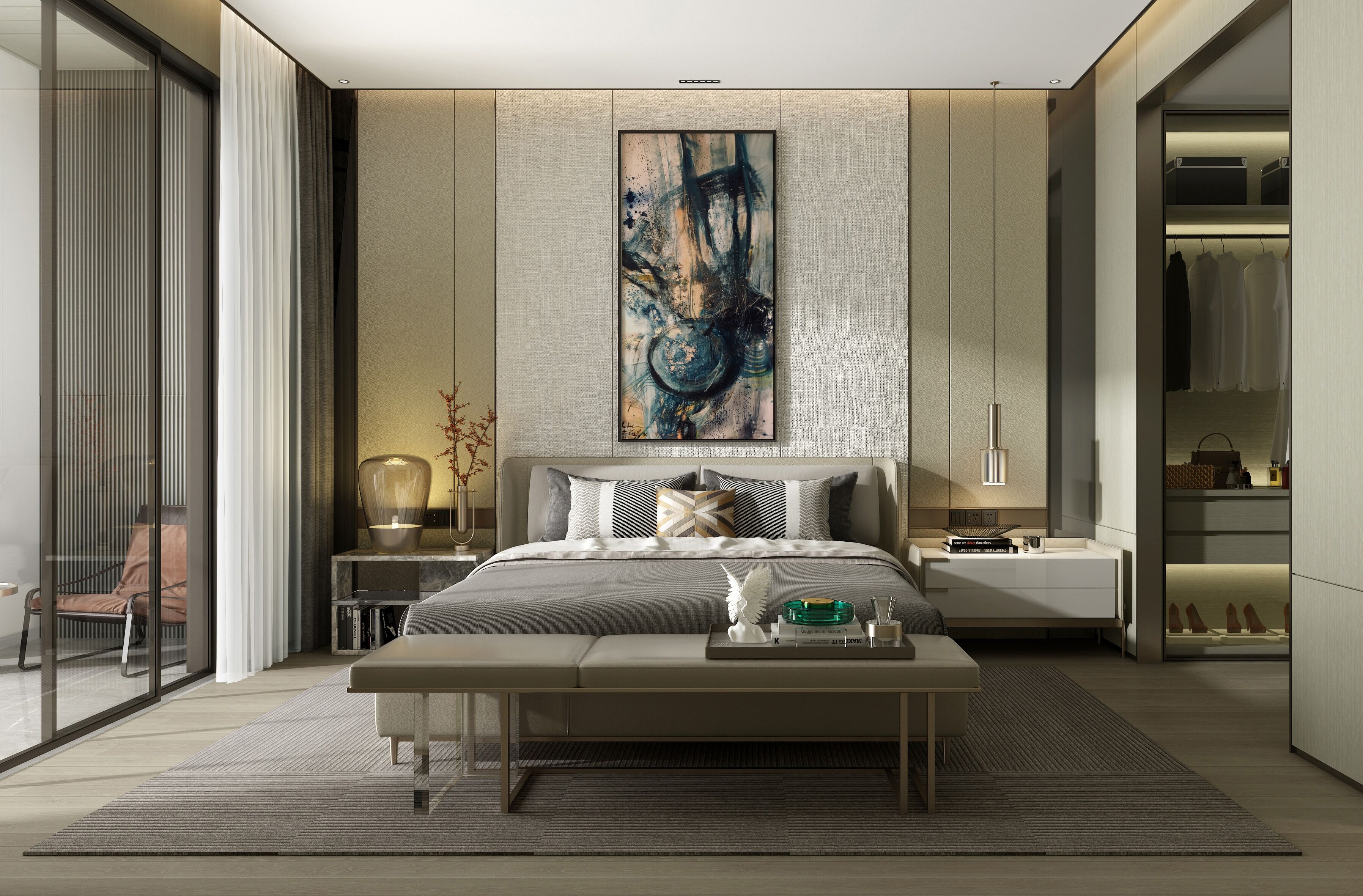
How To Redesign Your Master Bedroom

Art is an integral part of interior design. In fact, displaying artworks in itself is a form of art. Matching timeless art pieces with the interior can be perceived as a great way to add interest to a room.
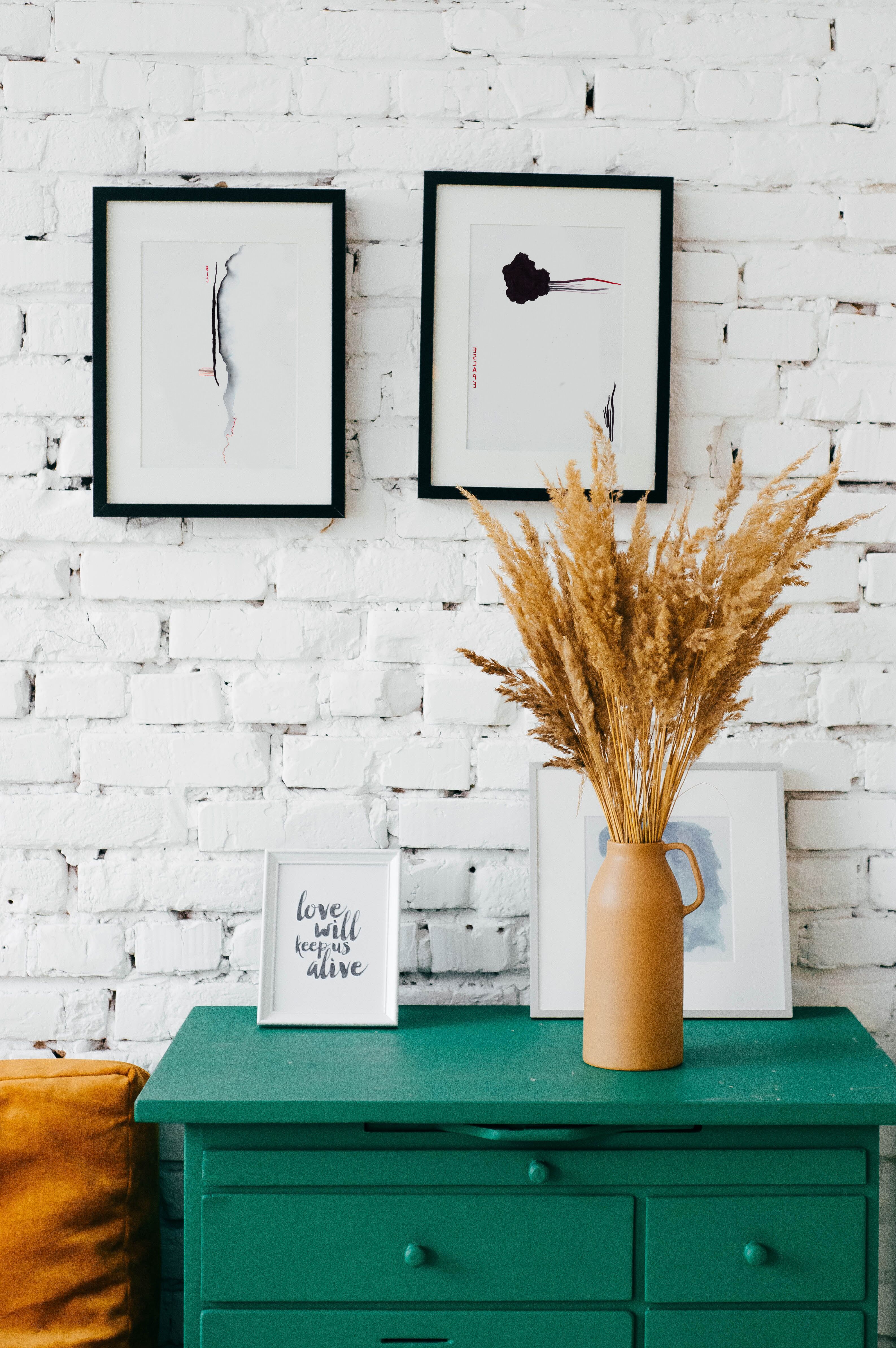
Art is an integral part of interior design. In fact, displaying artworks in itself is a form of art. Matching timeless art pieces with the interior can be perceived as a great way to add interest to a room. Yet, the exercise of matching artworks with the color palette, texture, contrast, and furnishings can be truly challenging. Embellishing a space with pieces from around the world provides it with a striking balance between uniqueness and creativity. However, the art of displaying artworks lies in the placement, color, and themes of the pieces which can make or break the décor of a room.
Home décor and interior design often reflect the personalities of the occupants. Art pieces are considered as accessories which last through ages; it is a style that endures through time. It offers a limitless quality that may sustain for hundreds or even thousands of years. For interior designers, it is crucial to already decide the theme of the rooms and the apartment itself, so their clients can settle upon a theme that bests match their personality.
Matching the Tone
The tone of the room can shape the choice of selecting artworks for space. The first decision you should look at before picking art pieces for your master bedroom is whether you are going for a casual or a formal vibe. This can also form the basis of determining the color palette for the room and the roughness or sleekness of the texture. As I mentioned in the article “Use Colors To Curate Your Dream Space,” the two sets of colors – warm and cool–have apparently different effects on our physical and emotional state. Light and bright colors, especially with warm hues such as red, yellow, and orange, on the one hand, protrude a casual feeling while sparking emotions of comfort. Cool colors such as green, blue, and purple, on the other hand, enkindle feelings of calmness and express a rather formal tone. In fact, art pieces featuring distinct lines and structure also offer a formal vibe to the room. Depending on the tone of the room, the right artwork can incorporate a professionally put together look.
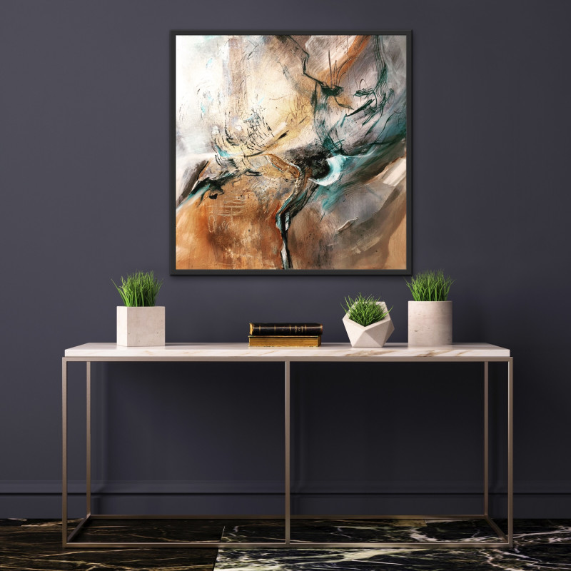
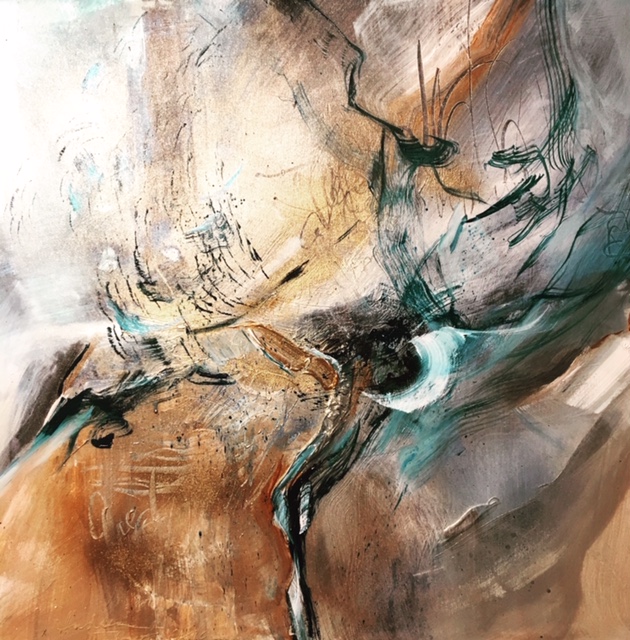
Curator's choice: Just Another Day I, Dyptich by Andrea
Matching the Color Scheme
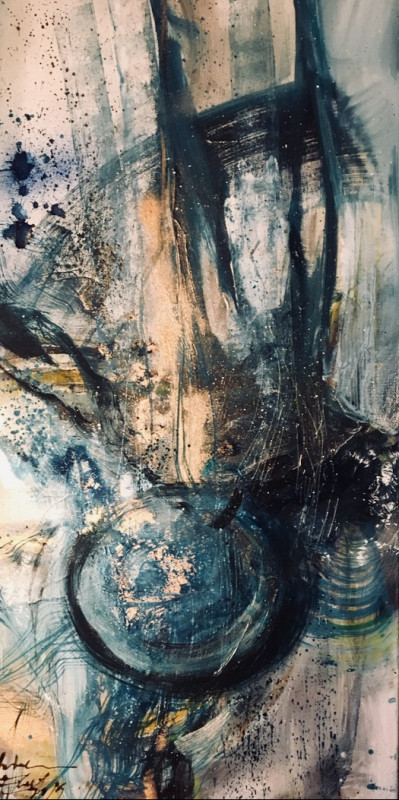
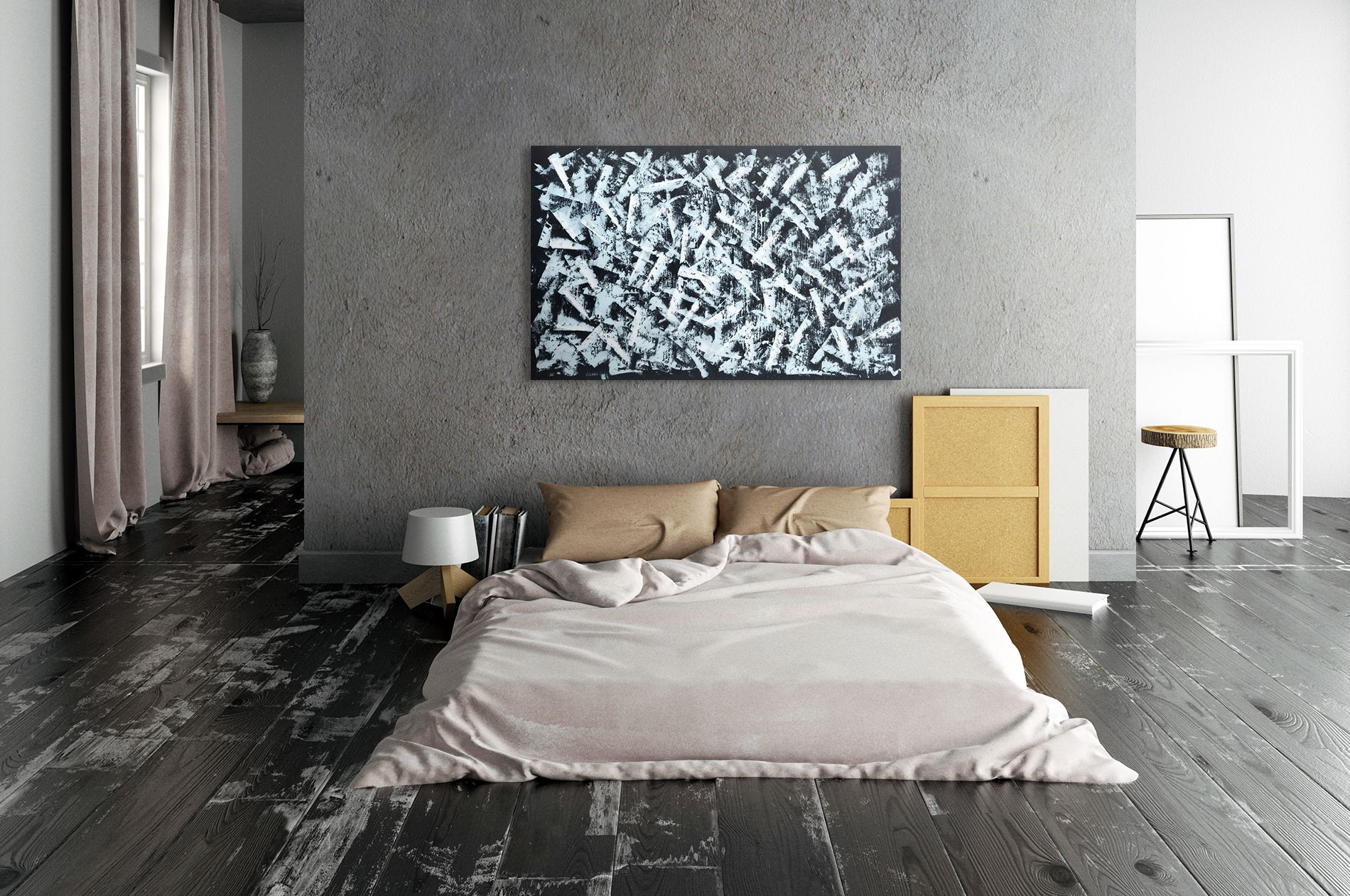
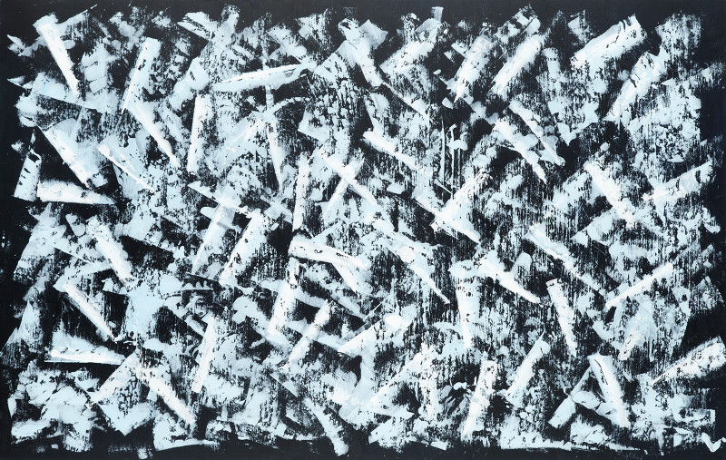
The color of the artwork can additionally make or break the décor of the entire room. A striking revelation in the interior design industry is making use of contrasting artwork colors for the room from its color palette. This promising technique is followed by several interior designers–embellishing a room that utilizes cool colors in its furnishings and color palette with artworks that exhibit a warm main color makes the artworks standout more in its space and vice versa.
Curator's choice: Atlantic Ocean by Anjela
Matching the Texture
The texture of a room defines it as intimate or sleek depending on how rough or smooth the bits of texture are. Choosing an artwork that supplements the texture can transform artworks into an eye-catching focal point which lifts the entire space of the room. In interior design, texture can range from refined organic textures, light, and dark woods to stripes on the wall. On the one hand, layers of texture and a focus on minimalism usually contradict each other. However, textures like linens complement artworks with a darker, assertive color where bits of texture can help add visual weight. The key is to create a balance. In fact, a big trend in interior design is also the terrazzo texture. People have been accenting their apartments with terrazzo tile floors, wallpapers, carpets, and even coffee tables to complement displayed art pieces.
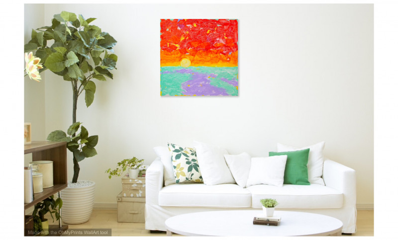
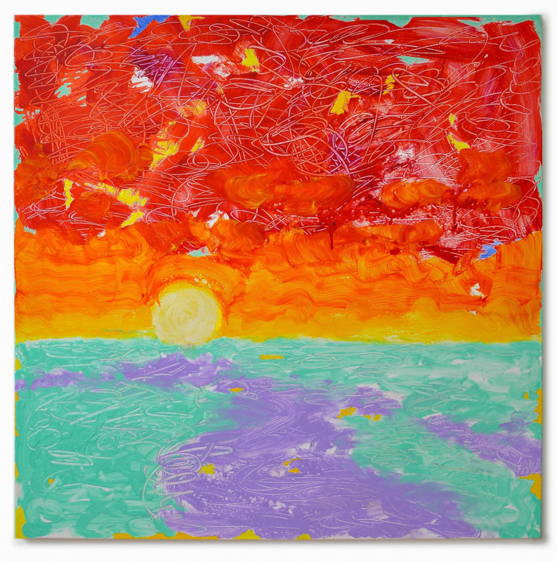
Romantic Getaway
Before selecting the perfect art piece, it is always essential to first locate the focal point of the room. The focal point of the room creates a perfect place for a piece of radiant red artwork. Embellishing a space with artworks exhibiting powerful pops of red sets the scene towards a rather passionate vibe which brings together the room in a subliminal way. A statement splash of radiant red not only displays passion and intense love but also strength and power. Supplementing the room with ruffle pillows shams, wood headboards, decluttered furnishings can as well help add a romantic touch. In fact, along with the color of fire and blood, ‘deep blue’ also provides for a peaceful romantic vibe.
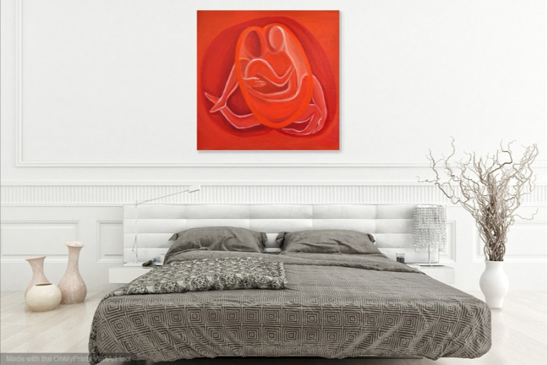
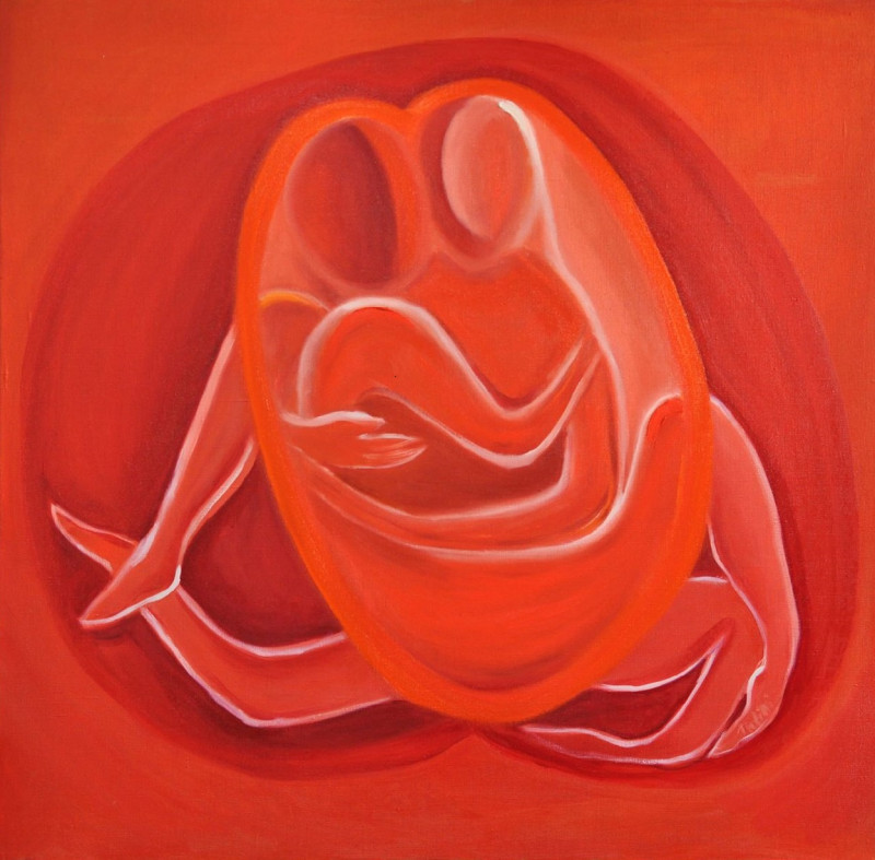
Curator's choice:Two Hearts by Tanya
Minimalism
Minimalism is simplicity; it involves working with less. As explored in the article “Exploring Minimalist Art and Scandinavian Interior”, minimalism offers a neutral-heavy color palette in its work with a focus on monochromatic hues. This artistic revolution works best with white walls and uncluttered spaces. Artworks with sleek, geometric forms and yellow and blue undertones are the hallmarks of minimalism. The “simplicity” element of minimalism establishes a serene environment in the space.

Curator's choice: Bic by Klára
Gold and Chic
Art truly improves the ambiance and quality of life. Accenting a room with a bar of metallic gold or rose gold flare create a sense of timeless chic and glamorous outlook. Yet, it is always essential to highlight gold in intricate nuances rather than as the main color. The color gold works best in the interior as accents and details rather than as a focal point. In fact, Nordic or Scandinavian interiors intensively utilize a combination of white and gold whereas several interiors also provide a combination of black and gold for dark tones.
Curator's choice: In The Storm by Andrea