MUST READ ART BLOGS
.webp)

.webp)
.webp)
.webp)
.webp)
.webp)
Greenspiration: How a Green Colour Palette Can Brighten Up Your Home

The rise of green has been around for a while. Think of Greta Thunberg reminding us to be environmentally conscious, and stores that sell reusable glass straws in compostable packaging quickly becoming the new mainstream. In the era of sustainability, being green is perceived as common sense. Yet, it is not only forming our new mindsets, but also our interior design choices.
There are plenty of benefits to using green in your rooms – it increases the feeling of well-being and is thought to relieve stress and anxiety; it represents tranquillity, good luck, health, and communicates balance, harmony, and calmness in the interior designs. Moreover, the wide range of shades and tones of green encourages everybody to find a suitable hue for their specific needs. Complementing it with other colors is also exciting; pair it with black or peach, and you will be surprised by the richness it adds to all the colors. And the options of adding a splash of green in interior design are endless – from painted walls and green artworks to plants and bedsheets.
If you are thinking about incorporating the color of life and nature into your next project, here is a pick of the most inspiring green interior designs that serve to inspire you.
DARK GREENS
Starting off with the more mysterious shades of green, this room shows how dark colors can actually make for a cozy and charming living room. The Mosque Green wall, incorporated with a complementary sofa and carefully chosen stylistic attributes, shows this room’s exceptional personality. The natural elements, like the big plant and branches on the table, bring invigorating nature to this living room and make a place for relaxation and recharging. Add more plants and a pine-scented diffuser, and it’s sure going to feel like you’re watching TV in the middle of the forest. All the liveliness and dynamism are well-complemented with a pop of golden hue on the wall that balances all the greens and makes the interior more organic to look at.
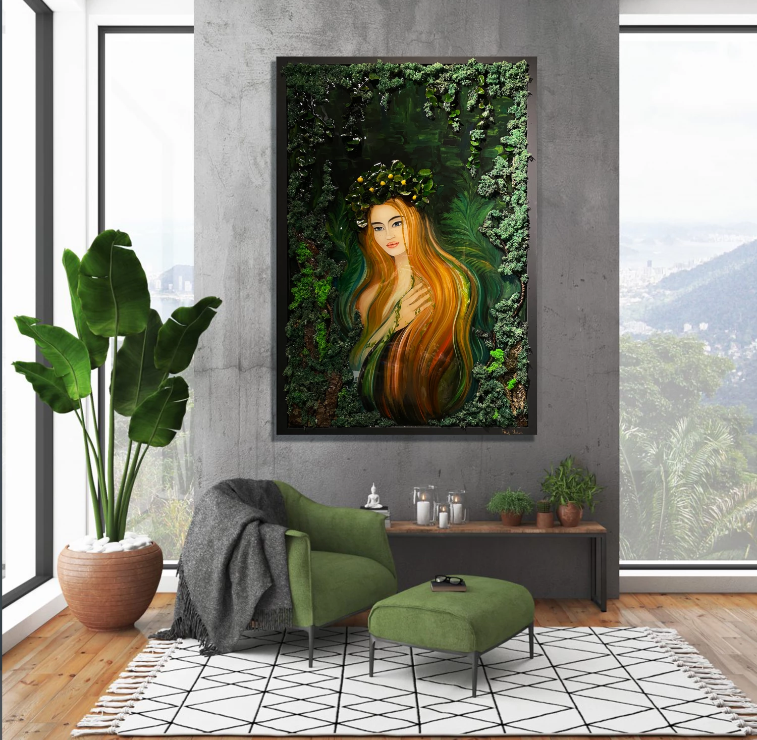
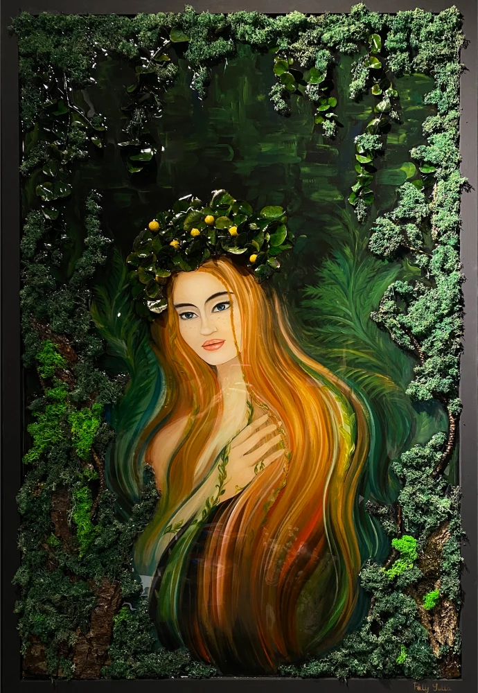
Curator's choice: WOOD NYMPH by Yulia
Try out our new AR feature with your phone to see how this painting from Yulia is going to look on your walls at home and office!
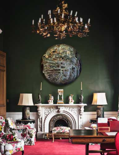
For an even richer and more sophisticated feel, a darker Mallard green can be applied to give the walls an intense and deep earthy pigment. The possible gloominess is well prevented with a high ceiling, lots of space, and natural light from the window. The openness with colorful furniture pieces and accessories adds further élan and zest to the room. While all the little details and color combinations make themselves very visible for observation, the very first notice goes to the large circular painting in the middle of the wall. Efficiently showing dense stone texture in a light circle form, this painting makes for a refreshing central piece to look at and ties the interior into a mystic and stimulating room to be in.
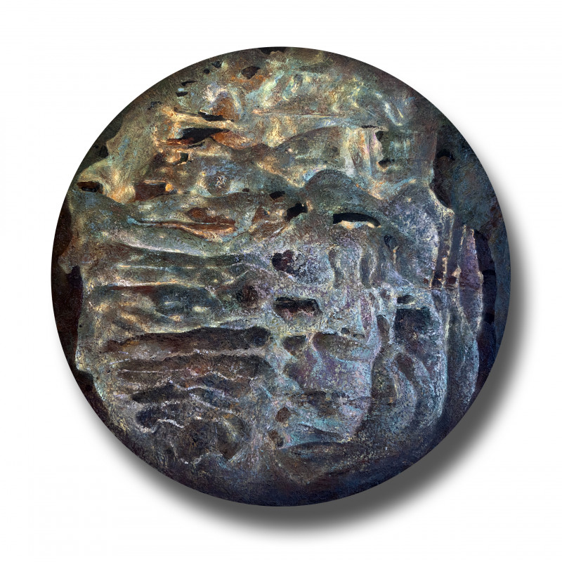
Curator's choice: LIGHT STONES III by Konstantin
Continuing with darker tones of green, this Goblin shade interior greatly contrasts the previous lounge room. While otherwise retaining a subtle and even minimalistic manner, the detail is accentuated in the form of a captivating painting.
LIGHT GREENS
If brighter green is more your style, then this Olivine shade, merged with whites and light browns, communicates green in a more fluorescent manner. The interior appears balanced, and the minimalistic pictures of flowers delightfully highlight the assortment of vases on the cupboard
For a more outgoing option, this Fruit Salad Green discloses a bold choice that is further elaborated with an abstract painting on the wall. To maintain some modesty, the furniture and accessory choice is minimalistic and subtle.
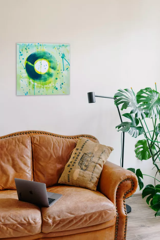
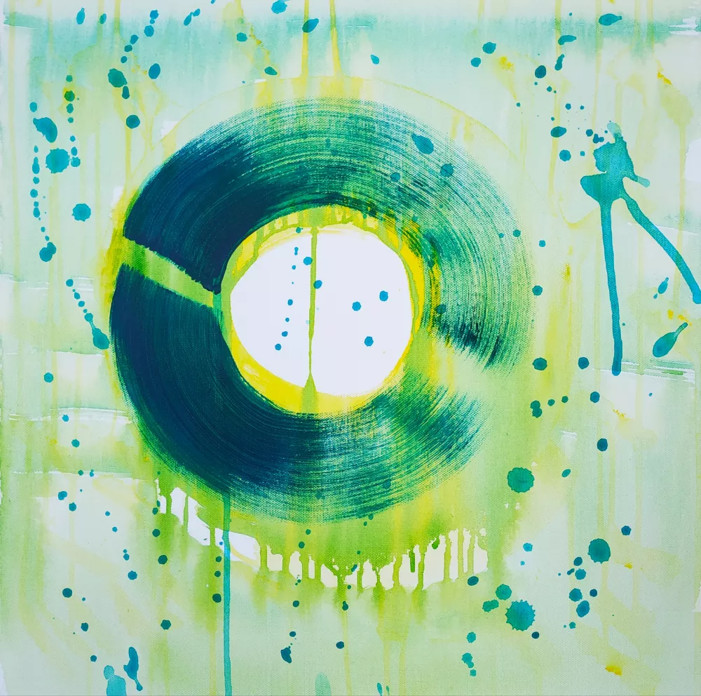
Curator's choice: CIRCLE 5 by Leila
Greyish-green tones have been popular for a while, and this is for a reason. While effectively adding a subtle pop of color, this greyish Cascade shade still retains a more neutral hue than its bright green comrades. A stylistic choice of combining this muted green with monochrome tones gives the room a modern vibe and shows how green can also create a modest and discreet ambiance. A pop of color is still added with a vase of flowers and an eye-pleasing painting.
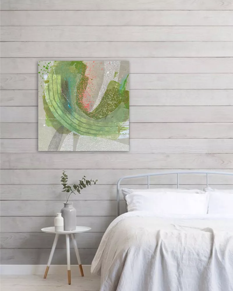
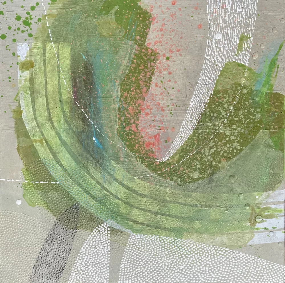
Curator's choice: PURE by Sandra
Hopefully, you can find some new inspiration for your upcoming project! For more artworks to fit your interior, check out our diverse collection of paintings, photographs, and drawings. You can also check our full collections to find the Green piece you like! In case you need help deciding, don't hesitate to contact us.

Which artwork utilizes a more sophisticated shade of green?
Scratch to find out!
|
|
|
|---|
CHECK OUT OUR BEST BLOGS


.jpg)