MUST READ ART BLOGS
.webp)

.webp)
.webp)
.webp)
.webp)
.webp)
Understanding Colours In Interior Design: And How to Choose Them for Your Home

The use of colour in the art industry has gone through a long history. Colour is an expressive element that has transitioned in the art industry from being an intrinsic part of a material to an interchangeable attribute of an item. Colours might just be pigments that define physical material but they have the ability to alter moods and atmosphere.
In fact, interior designers, graphic designers, advertisers, and artists for years have made use of colour to evoke certain emotions or create a subliminal message.
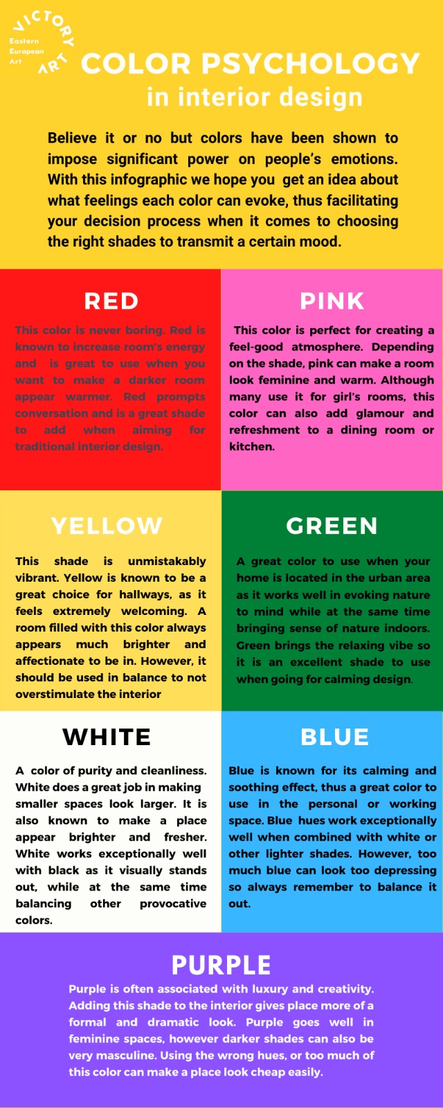
Colour plays an overwhelming role in the overall well-being of an individual; the colour one surrounds himself with have a direct influence on one’s mental and physical state affecting productivity, motivation and general well-being.

The two sets of colours have different effects on our physical and emotional state. Bright colours with warm hues, such as red, yellow, and orange, spark emotions of comfort and warmth whereas cool colours such as green, blue and purple enkindle feelings of calmness. This is why warm colours fit well in spaces requiring mental alertness, whereas cool colours are used in relaxing places.
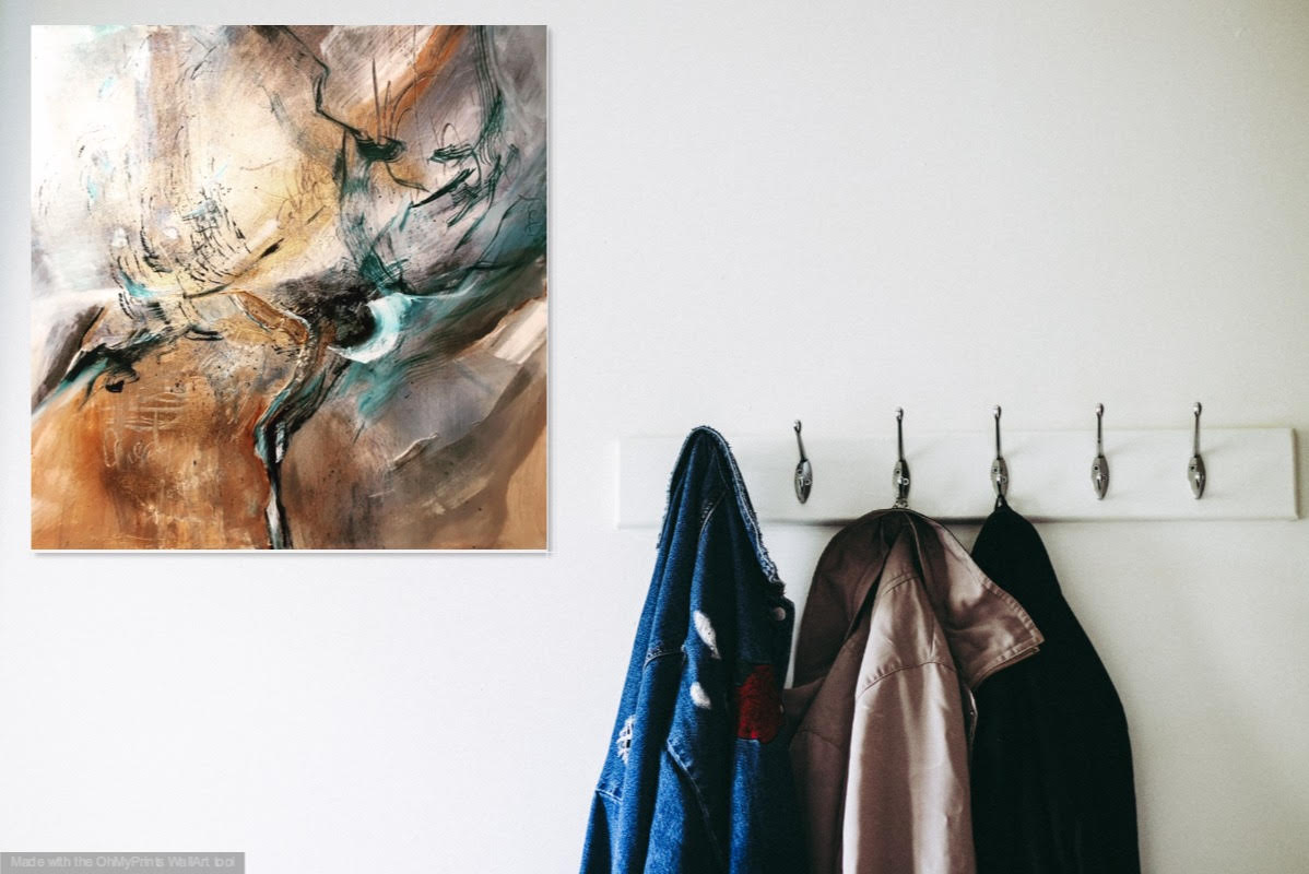
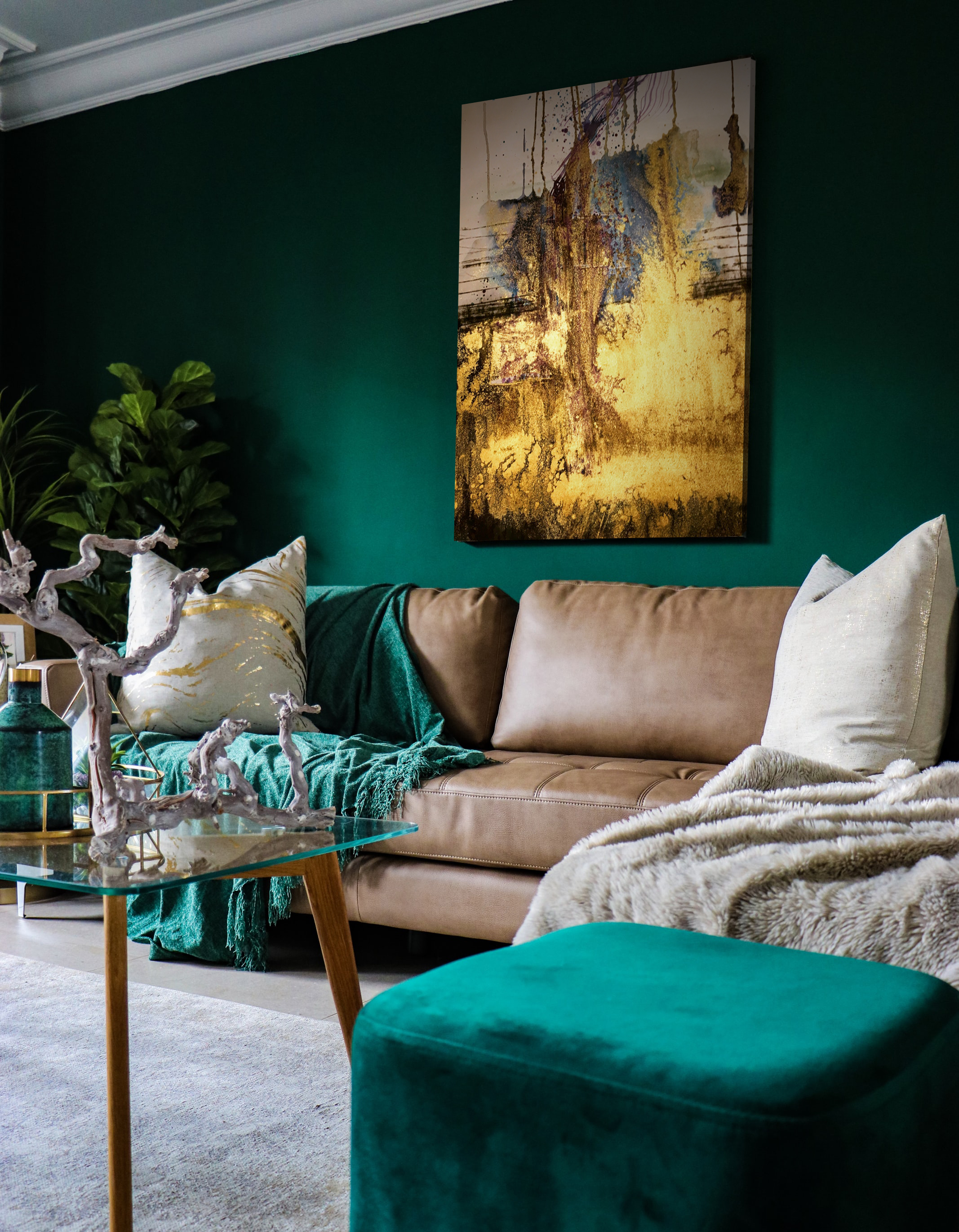
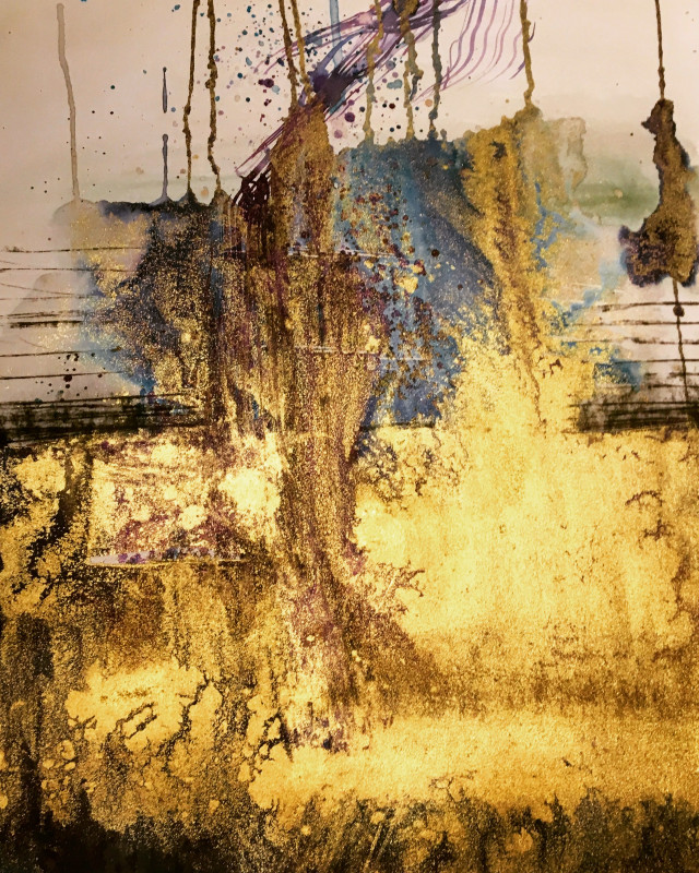
Curator's Choice: Depth by Tanya
Try out our new AR feature to see how this painting from Tanya is going to look on your walls at home and office!
WARM COLOURS
While decorating your room, you should be careful about the use of warm colours. Bright colours like orange and yellow reflect light and can cause irritation due to excessive eye stimulation; these colours, hence, best work when used in undertones to convey emotions of happiness.
These colours are also often associated with food and can cause hunger. This is the reason why most restaurants paint their walls red, yellow or orange or use these colours in their logos.
YELLOW
The colour yellow is often associated with light and sunshine and evokes a sense of optimism and wellbeing. Artists work with yellow undertones to enkindle feelings of hope, happiness, and wisdom in the viewer.
A lot of painters also work with this colour to depict a melodramatic or romantic mood in their pieces. Vincent Van Gogh used yellow as a prominent colour in his artworks including Sunflowers, The Yellow House, The Bedroom. It was his favourite colour.
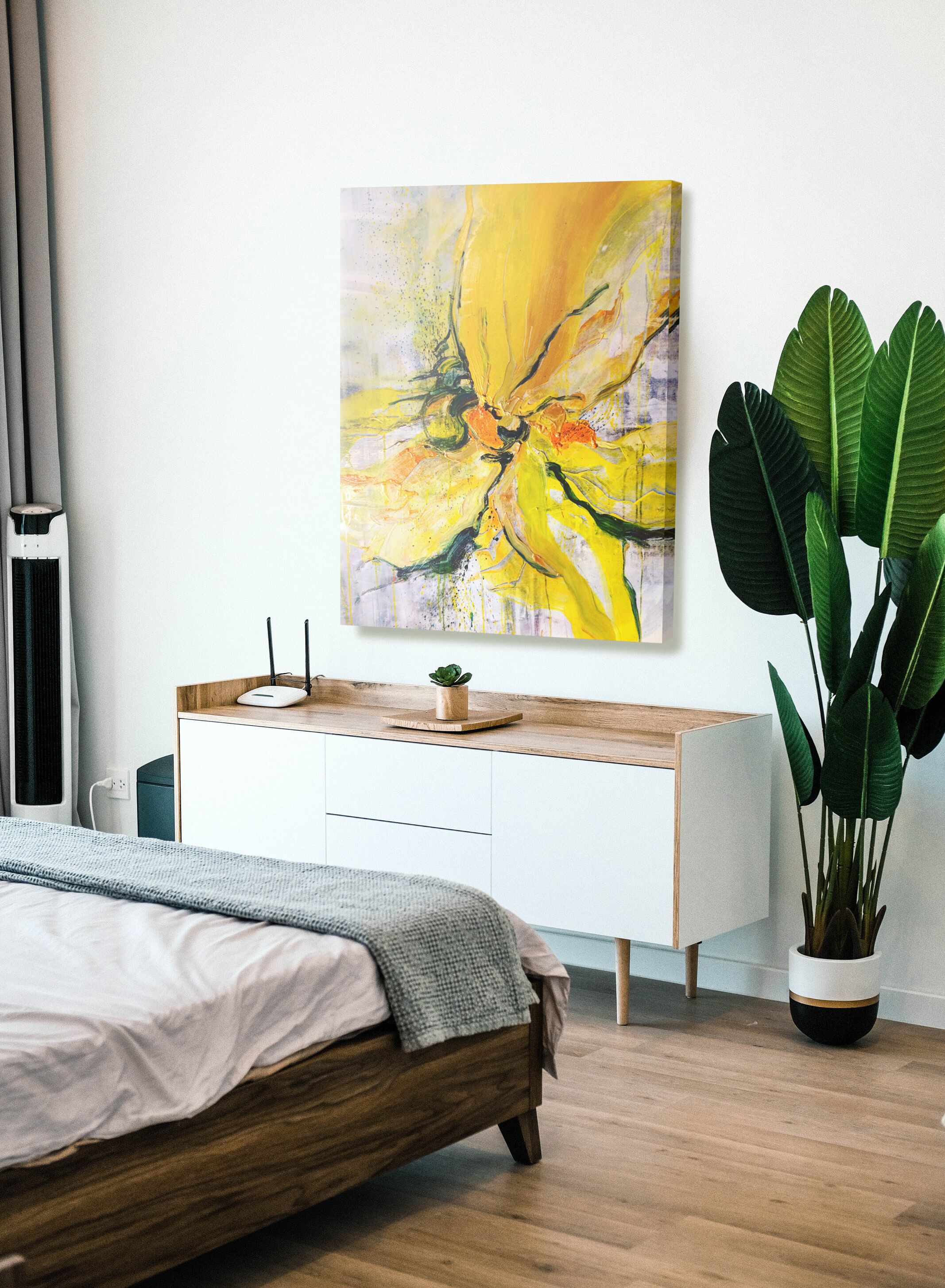
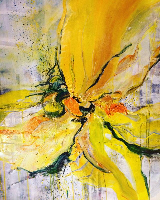
Curator's choice: Yellow Power by Andrea
In fact, not a lot of people know this but Van Gogh used to eat yellow paint. Drenched in melancholy and resignation, he associated this colour with bliss and cheerfulness that he believed that painting his internal walls yellow would bring him happiness.
Sometimes you ache for even the craziest ideas to work.
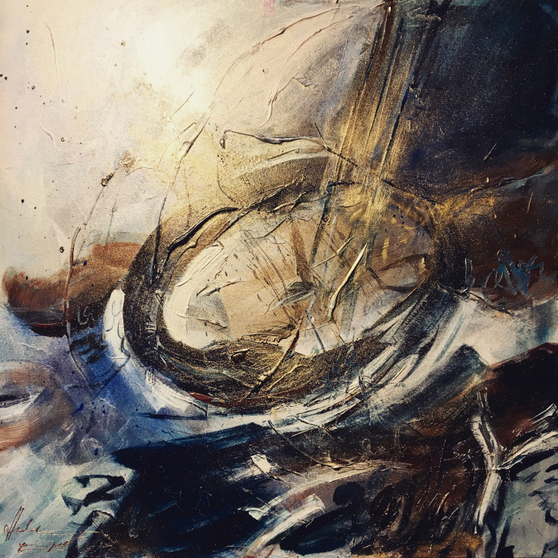
RED
Red provides an intense experience packed with emotions ranging from passion, tension, love to anger and violence. It represents both the angel and the devil, depending on how you use it. Surround yourself with red to add a little bit more power to your surroundings. A little bit more passion. A little bit more pleasant.
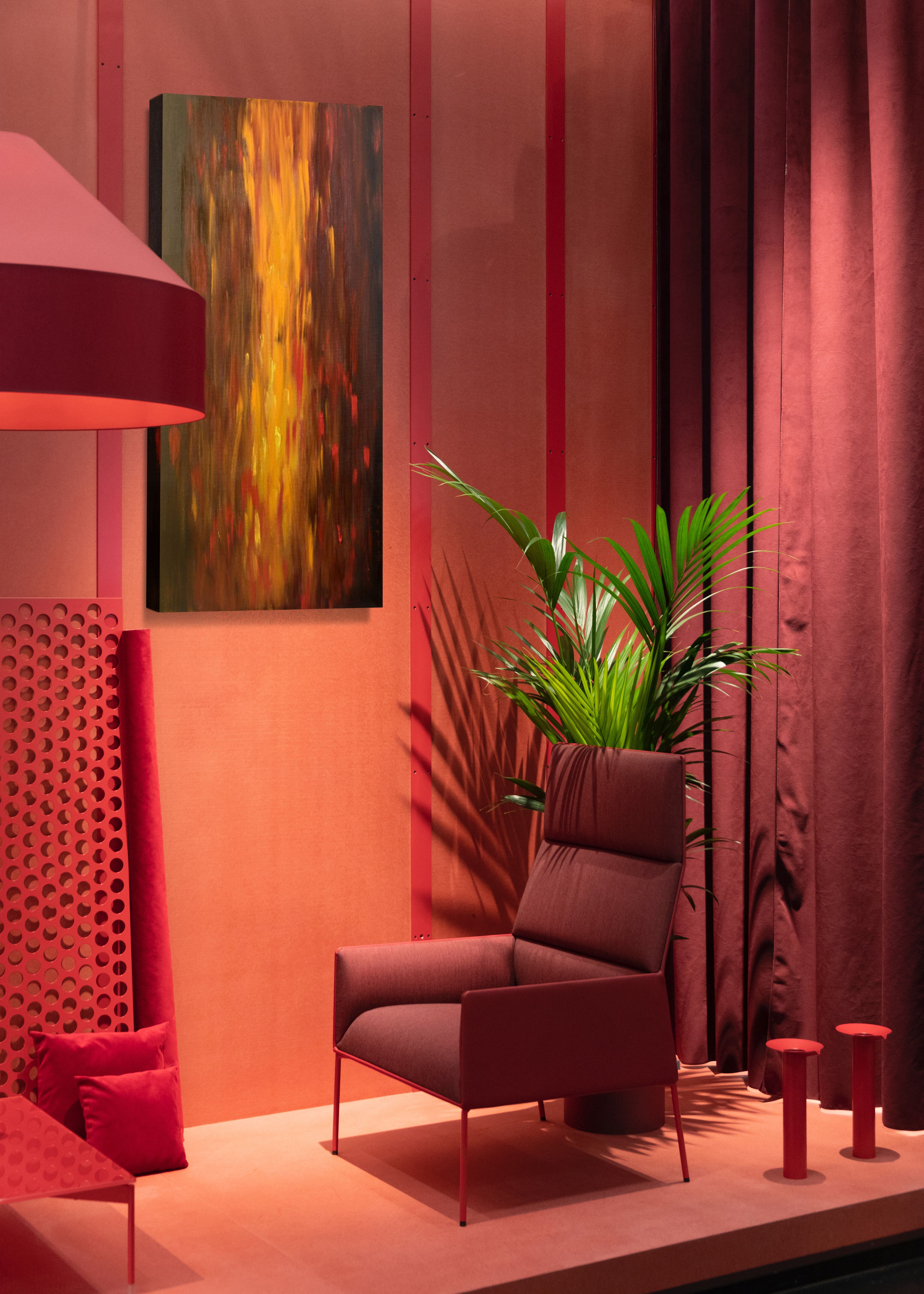
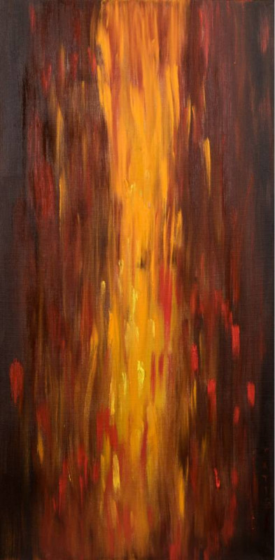
Curator's choice: Fire of Life by Tanya
ORANGE
Orange is the bright love child of red and yellow and has the hallmarks of both colours. Not only is it happy like yellow but also passionate like red. It is as flamboyant as it is as stimulating as red. Studies have shown surrounding yourself with this colour increases appetite, brain stimulation, socialization and activity. Are you looking for a little motivation: treat yourself to a little bit of orange!
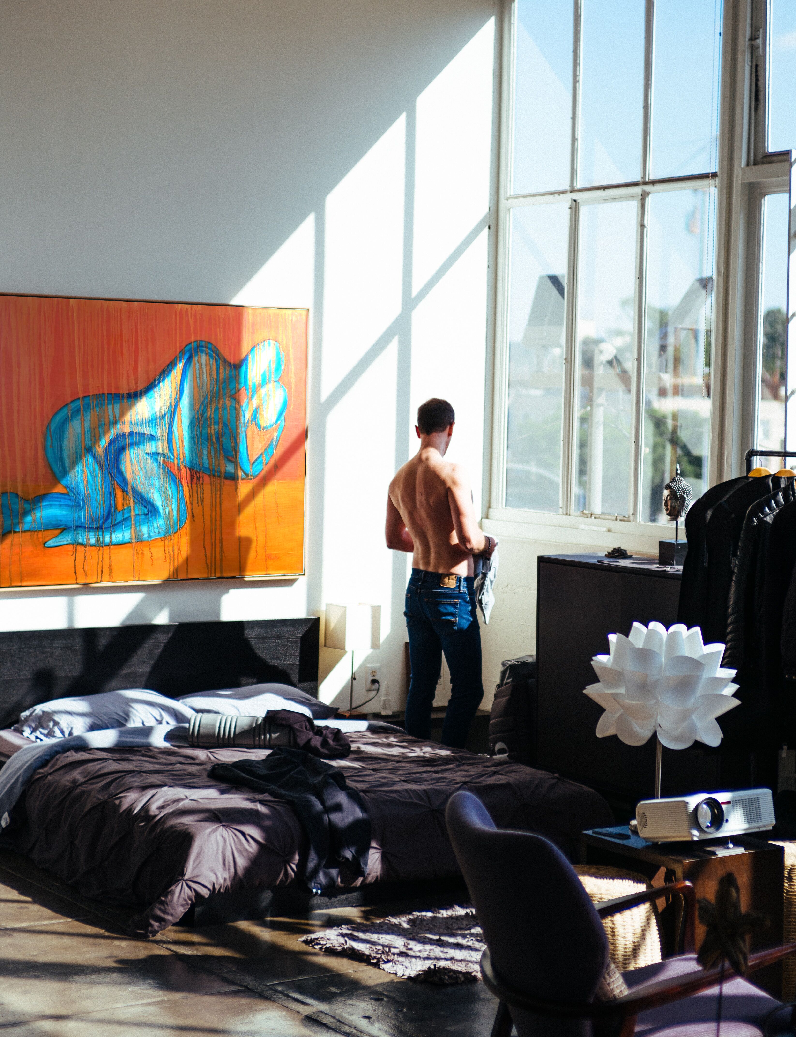
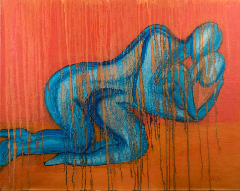
Curator's choice: Flow by Tanya
BROWN
The colour of ground and earth, brown represents practicality. It is one of the most down-to-earth colours that signify reliability, approachability, friendliness and structure. Decorating your space with brown colours can help your industriousness and your working efficiency. But don't get too serious, brown would like to have a little love from other warm colours to light up your life.
Curator's choice: Indigo Feeling II by Andrea
COOL COLOURS
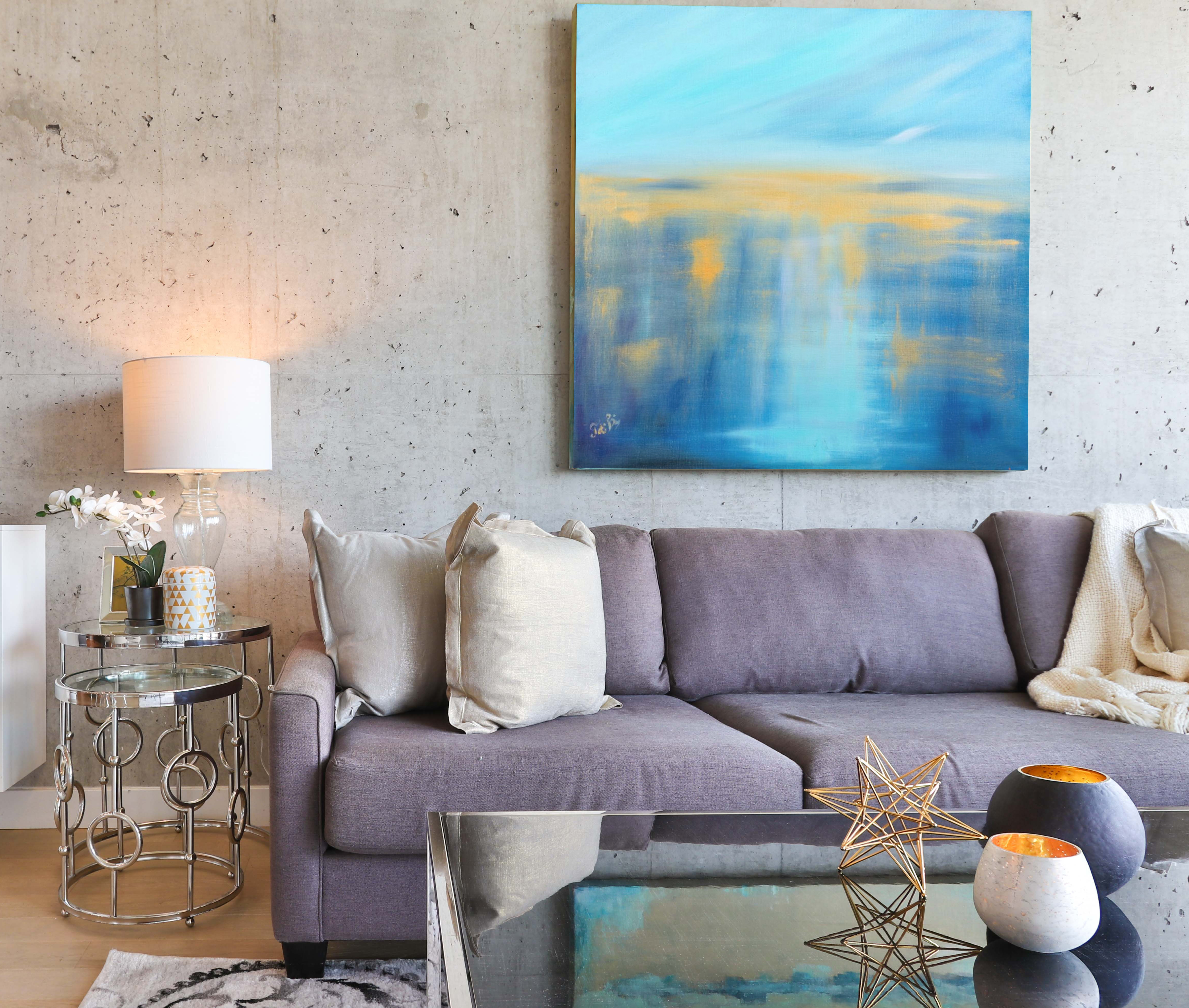
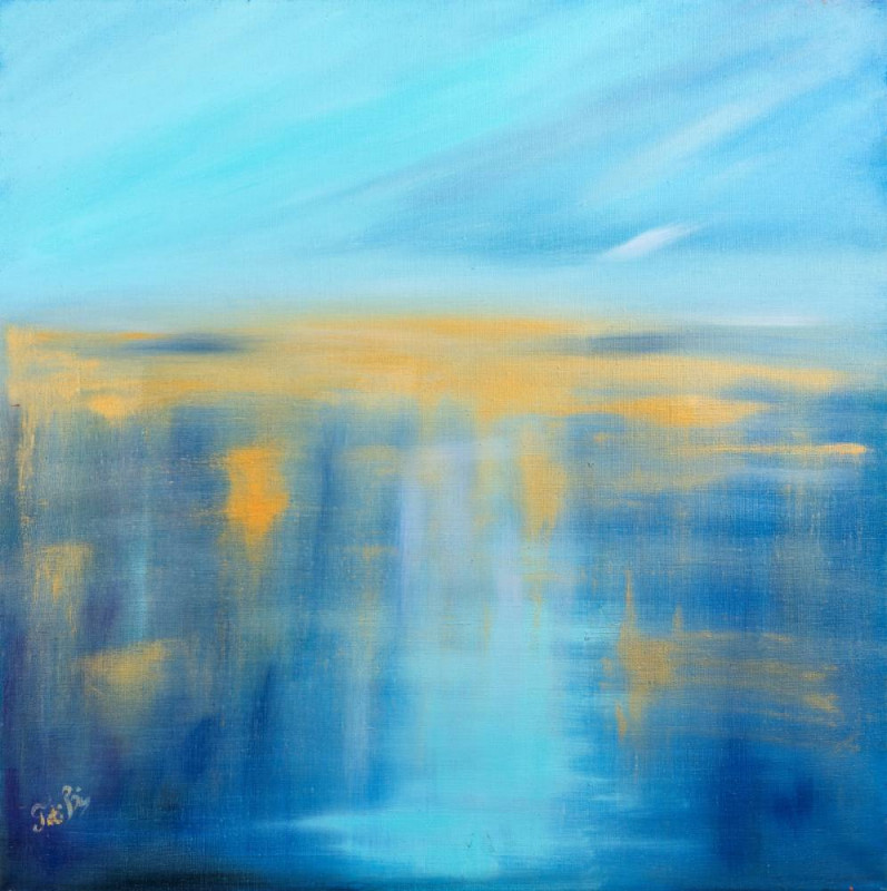
BLUE
 This universally soothing colour is often used in bedrooms and quiet environments as it kindles a soft, relaxing and compassionate feeling.
These colours range from cold icy blues to warm and nurturing Mediterranean turquoises.
The quiet character relates to a quality of openness and expansiveness. This colour is so calming that it is said to lower blood pressure and respiration.
Yet, the poetic subtlety of this colour also relates to despair and melancholy.
The famous painter Pablo Picasso painted a series of deeply sentimental paintings to express his trauma through the colour blue. These artworks comprised his “Blue Period”.
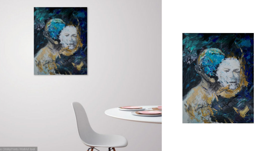
Curator's Choice: Ego by Zuzana
GREEN
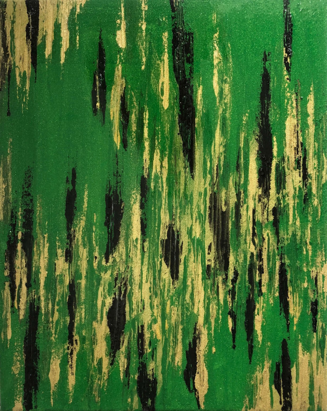 The incredible shades of greens, especially pale greens, are another restful and relaxing colours just like blue.
Since green is a secondary colour obtained from the two primary colours, yellow and blue, it carries the effects of both shades.
A combination of elevation and calmness makes green a representative of stability, tranquillity, good luck and health. This colour of harmony, balance, and serenity is also claimed to have healing powers.
Unlike bright warm colours like yellow and orange, green shades are proven to be less strainful on eye muscles and provide a nonchalant and peaceful feeling.
Water Lily by the French painter Claude Monet attracted attention as the noticeable use of green shades brings about an overwhelming calmness.
Read more about the use and power of green in interior design to see which variation is the right fit for you.
Curator's Choice: Underneath by Andrea on a Mosque green wall
TURQUOISE
 Turquoise, lying between blue and green, is usually associated with serenity, calmness and peace.
Carrying the characteristics of blue, green and yellow, turquoise symbolizes balance, creativity and emotional control.
Turquoise carries an introspective meaning, which emits a sense of self-loving and emotional reflection for those preferring this colour.
However, adding too much turquoise in your room is not recommended as it symbolizes an out-of-touch personality and indifference towards the outside world. A help from brown or any neutral colours can help your room gain an earthly balance.
.jpg)
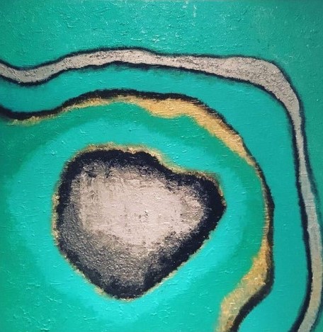
Curator's choice: Minerals by Eliška combined with neutral browns
Try out our new AR feature to see how this painting from Eliška is going to look on your walls at home and office!
PURPLE
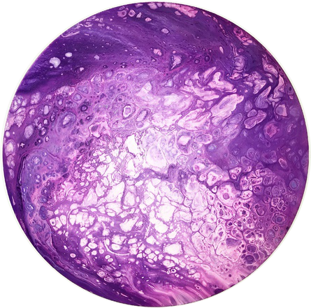 Purple utilizes shades of red and blue to provide a balance and encourage creativity.
Lavender signifies refinement and creativity and works excellently as a foil for artworks used in homes and offices. Yet, purple can also be used on canvas to display gloomy feelings.
Pale shades of purple, on the other hand, are serene and can relieve tension.
Lilacs in a Window by Mary Cassatt depicted simple objects of a dark vase with purple and white lilacs.
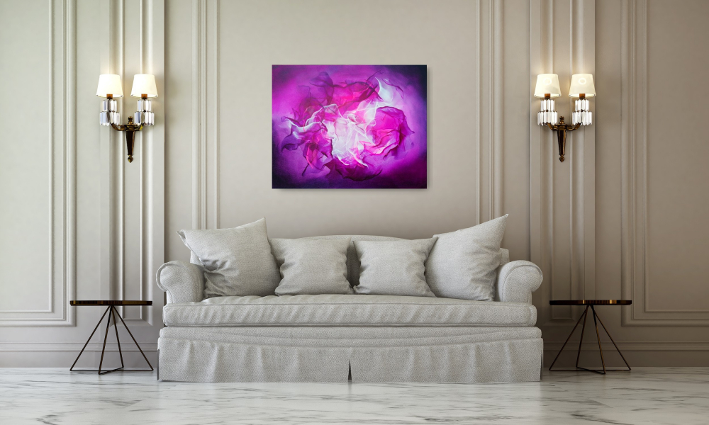
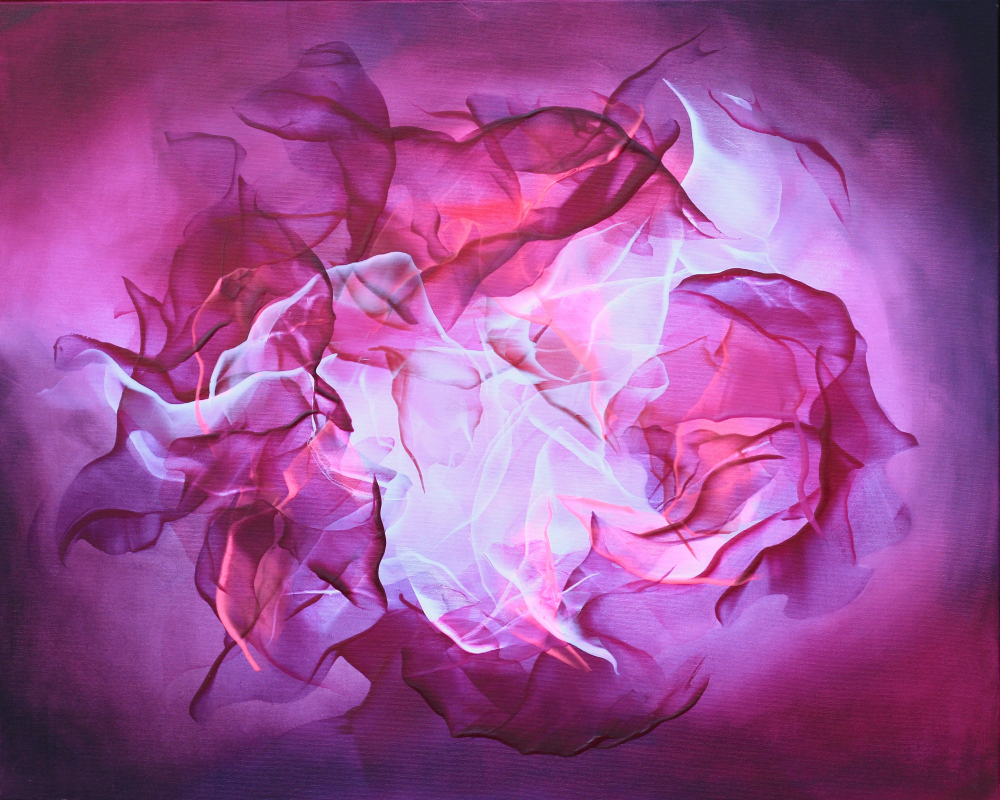
Curator's Choice: Birth of a Star by Katerina on a purple wall
PINK
 A little bit of reddish touch and a whole lot of white, pink in your room provides hope. It represents compassion, love and nurturing, and a comforting feeling that everything will go well.
It helps alleviate the choleric feeling of red and the phlegmatic aura of blue.
Nowadays, it seems as if some men are afraid of pink as it is typically represented with feminity, but fear not, my friends. Pink cherry blossom in Japan, dropping at 5 cm/s, is the symbol of perfection and politeness.
Too much pink can weaken your emotion and self-worth, so adding cold colours like blue or dark green can provide a practical balance in your space.
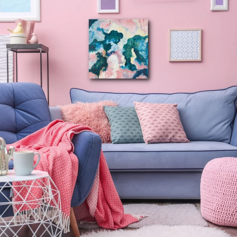
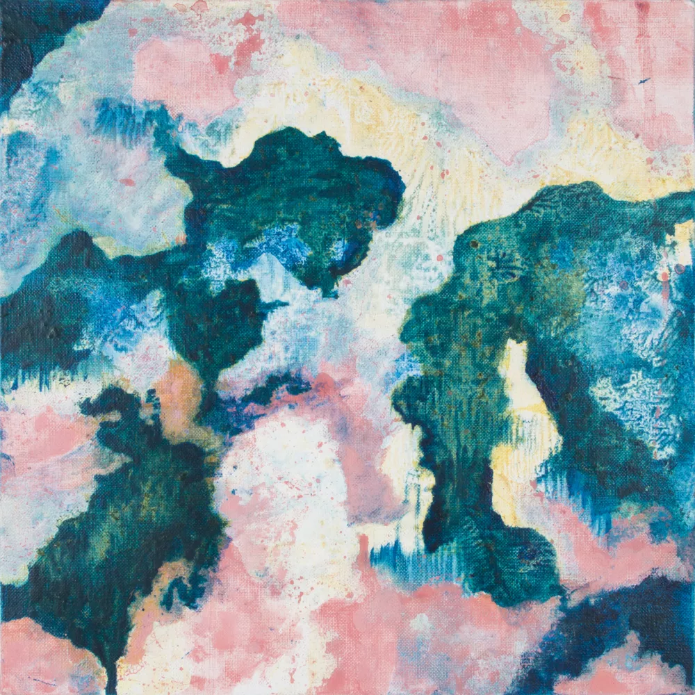
Curator's choice: Abstract05 by Blanka in a pink and blue interior
COMPLEMENTARY COLOURS
Complementary colours, when used adjacent to one another display a strong visual impact. These colours are in fact placed on the opposite side of each other on the colour wheel. The most appealing combination of colours results from an amalgamation of red and green or blue and orange or even yellow and purple.
Curator's Choice: From one world to another I by Zuzana
TINT AND SHADE
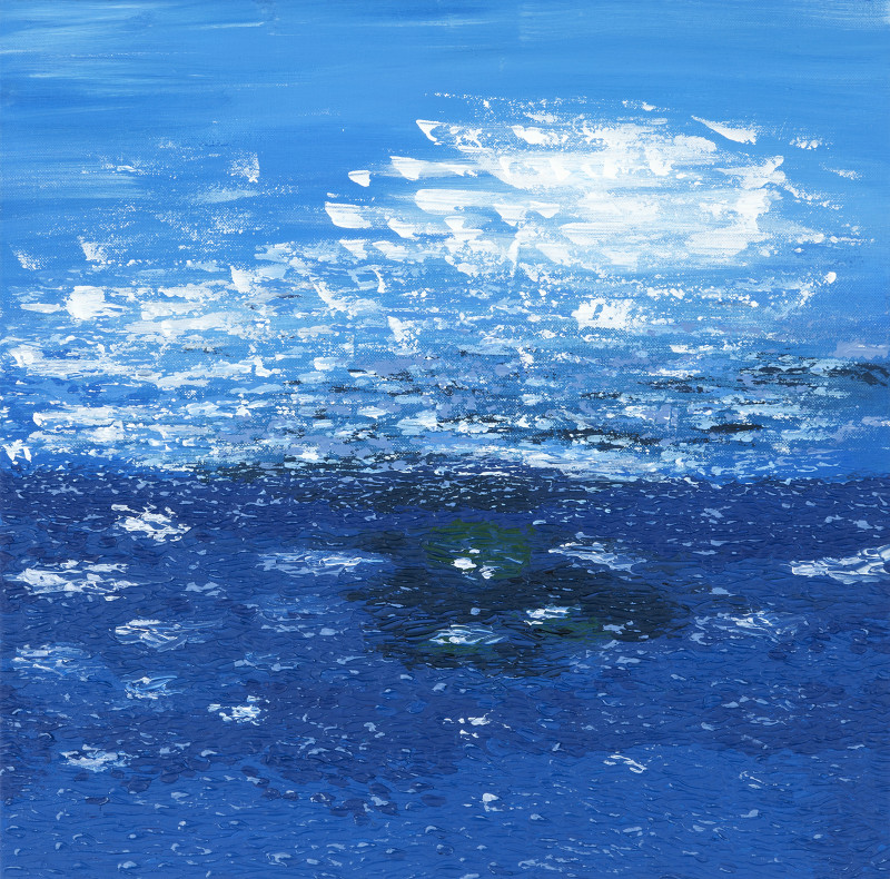
White is a symbol of innocence, safety, and purity. Many artists use undertones of white to lighten dark and warm colours but in moderation to not make the artwork chalky or lifeless. Including white in warm colours creates a feminine outlook. This is called adding ‘tint’ to create an effect of simplicity.
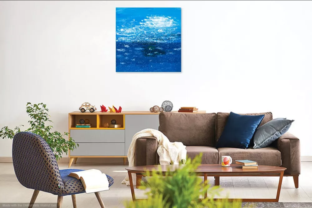
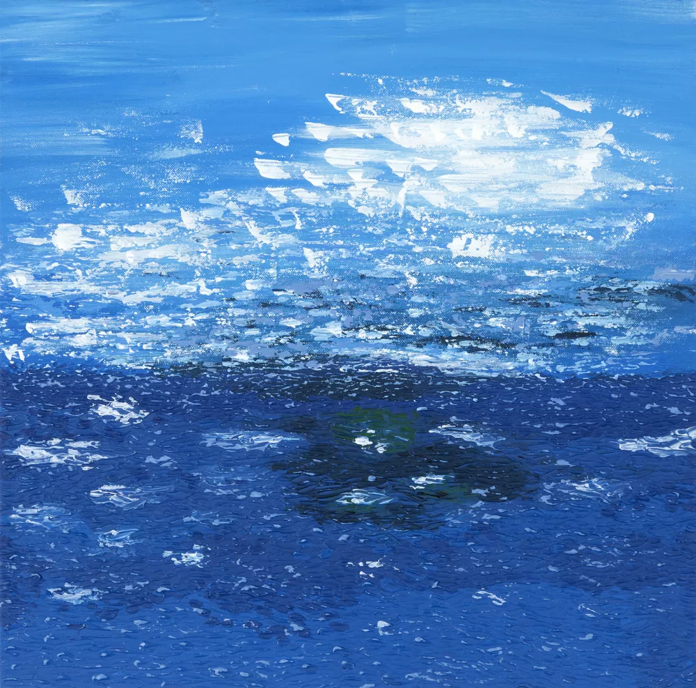
Curator's Choice: Calm Sea by Leila
Black, on the other hand, can convey a morbid feeling. This colour is known to punctuate contrasting colour schemes. Black is used to ‘shade’ a colour, i.e., to add power to colours and darken them. Adding black into existing colours can give it a masculine and powerful outlook.
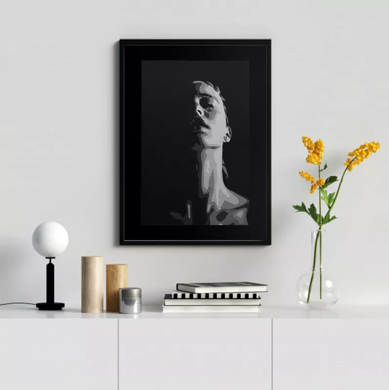
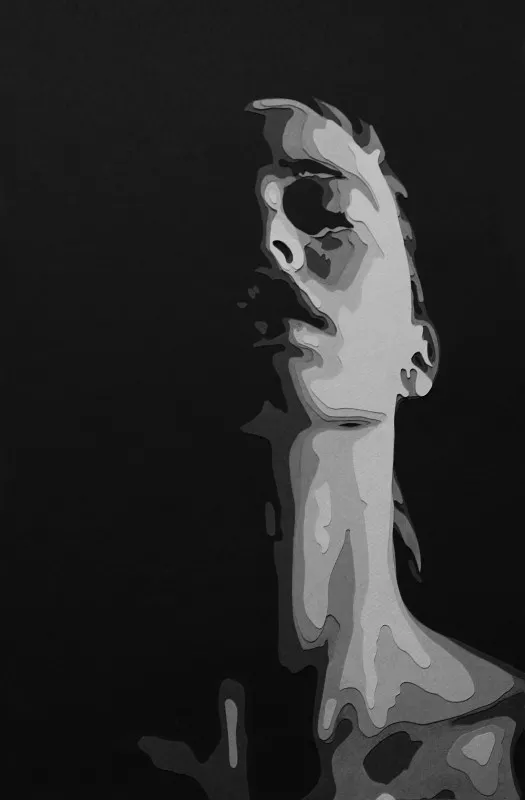
Curator's Choice: Passion by Naďa
Want to read more about colour and interior design, click here! You can also check out our special collections to find more inspirations for your space both at home and office! Not sure which artwork to buy, no worries, check out our rental art services, and if you need more help or special requests, feel free to book an appointment with us!

Which artwork is a drawing (rather than a painting)?
Scratch to find out!
|
|
|
|---|
CHECK OUT OUR BEST BLOGS


.jpg)